The Inclusive Workplace
Accessible design for Canadian job seekers
The Inclusive Workplace is the first Canadian website designed to help the 500,000 unemployed or underemployed people in Canada with autism or intellectual disability find good jobs and navigate their workplace.
Read how we designed an accessible website that is targeted, useful, and relevant for all users during COVID-19 and beyond.

Role: Creative Director, UI, UX, Illustration
Timeline: Dec 2020 – Sept 2021
Team: Client lead (Radha MacCulloch), internal stakeholders, development teams
Deliverables:
Website – Figma prototype
Design – Brand Guidelines, Design System and Design Templates
Challenge
Trans Care BC needed a complete design overhaul to more accurately more accessible and user-centered website to serve trans and gender-diverse people, their families, and care providers across British Columbia. The existing site was dense, difficult to navigate, and misaligned with how different audiences approached care journeys and information seeking.
Approach
Through one-on-one interviews with our ASD and ID target audiences, we uncovered their challenges in gaining meaningful employment. People with Autism Spectrum Disorder or an Intellectual disability are some of the most under-employed people in Canada; We made sure to recognize that people with Autism Spectrum Disorder or an intellectual disability also had other challenges, such as poverty, access to technology, access to support.
Solutions
Information Architecture
We focused on simplicity and plain language to make users feel in control when navigating the site. Information was presented following a linear progression to make it easier for users to understand the steps in gaining and maintaining employment.
Design
Consistency, clarity and structure were essential to successful design for our target audience. Our design system included layout structures, restricted colour usage, and tight guidelines for all photos and video.

Content Strategy
We simplified complex topics while retaining key information and maintaining a respectful mature tone.
Tailoring the experience to user needs
Personalizing display
The Inclusive Workplace needed to create an optimal viewing environment for users with heightened visual sensitivity as well as those with visual impairment. “Calm” and “Contrast” modes were developed to accommodate the diverse needs of these users. The ‘Calm’ mode implements a desaturated palette and uses alternate versions of images which have been edited to remove strong colour contrast or background visual noise. Icons may be removed or simplified in this mode.
Sample “Calm”/”Contrast” modes
View examples of “Calm” and “Contrast” modes.
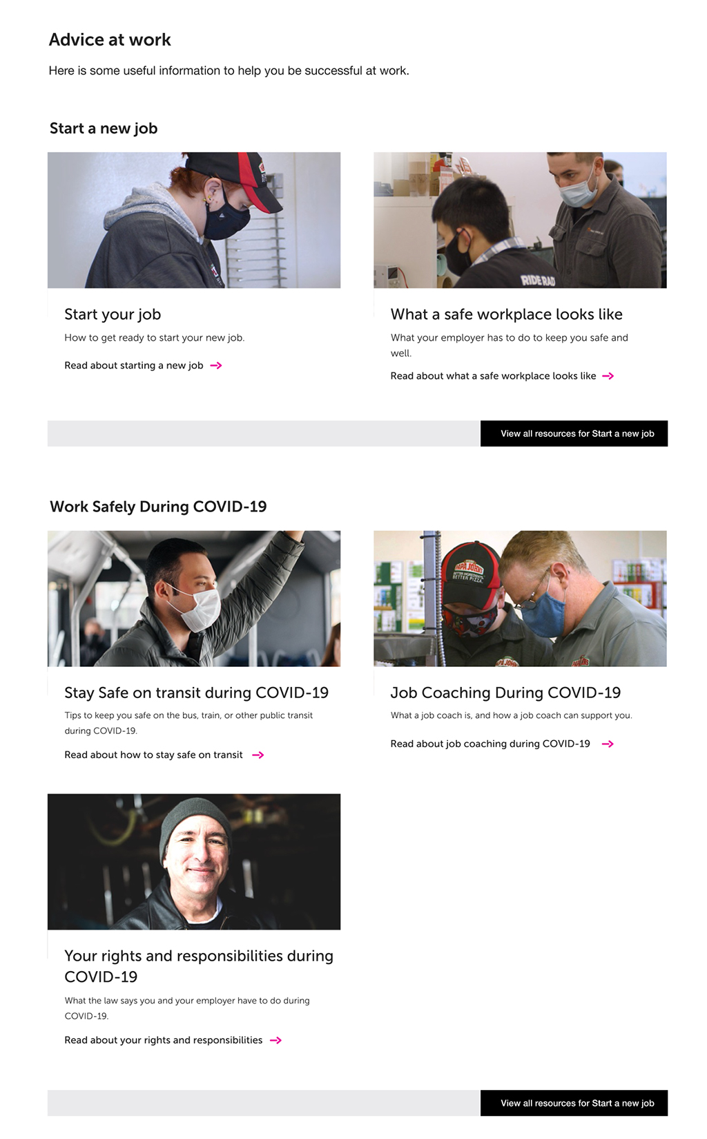
Prioritizing content
Making key content easy to find
Placing video or course content at the top of the page gives users easy and quick access to the most important content on each page. Displaying video or course length sets users expectations for time needed to complete.
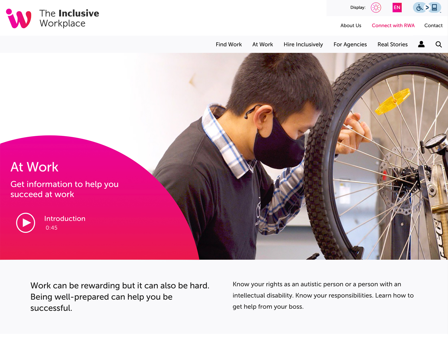
Pacing engagement
To help users focus and make their way through the site at their own pace, we used graphical elements consistently and constrained content width for shorter lines of text. We provided “calm spaces”, clear dividers, and focus areas throughout. To increase predictability and ease of use, we defined 4 page templates that could accommodate all site content.
Defining actions or behaviours
Promoting understanding through visual aids
We kept graphical elements to a minimum, focusing on those that would enhance comprehension. These included checklists or content that required a series of steps for completion.
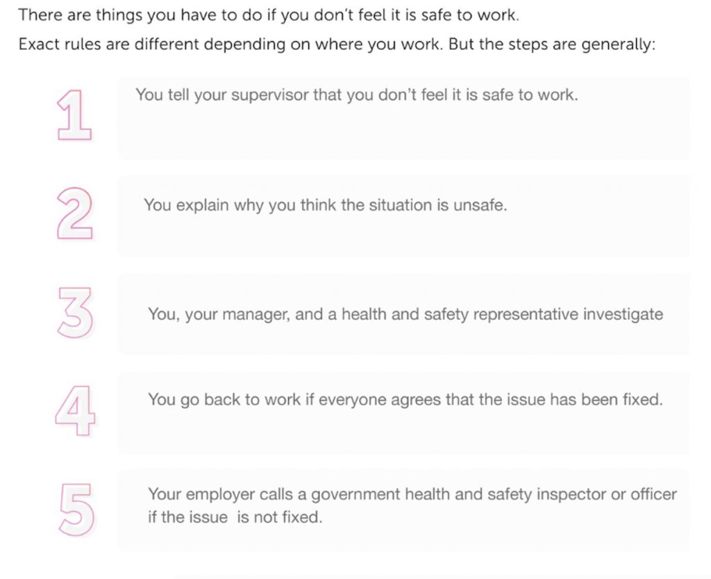
1. Preparing users for multi-step tasks
Example
Large, strong numbers are used in lists involving steps or stages so that the user knows in advance how many steps are required to complete the task. Users who have difficulty with multi-step procedures then have a chance to contact their job coach or support person before embarding on the task and becoming overwhelmed.
2. Using icons to queue behaviours
Example
A small set of simple and commonly used icons are used sparingly, only when they support comprehension or encourage a behaviour such as checking items on a list.