Strong, friendly, relaxed, professional, gender inclusive
Full colour logo
The logo dissected


The pebbles to represent the 3 stages of life – youth, middle age and old age.
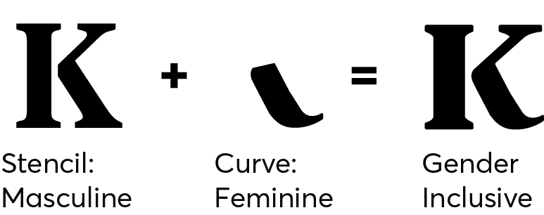
A strong but curved ‘K’ which is more gender neutral
KITS – all caps and sans-serif to be proper, strong and professional
lowercase ‘family practice’ makes it welcoming, relaxed and friendly
